 logo

Mobile devices are now the leading platforms for online engagement among many users. Despite their bigger screens, users prefer mobile devices due to their convenience and accessibility in a world where WIFI and internet connections are ubiquitous. Whether it’s waiting for an appointment, standing in line at the checkout, or just killing time at work, browsing websites or making purchases online occurs more than ever on smartphones and tablets rather than a computer device. Apps enhance this by making these activities more effortless, more convenient, and more fun. This transition significantly impacts how businesses develop their online presence, especially their websites. Search engines, like Google, which controls 90+% of all search traffic, now prefer mobile-friendly sites as they enhance the user experience in contrast to the old model of creating separate mobile and desktop sites. Consequently, optimizing for mobile is essential for influencing SEO rankings to bring more organic traffic to your website.

Grasping and applying mobile optimization significantly enhances your visibility, traffic, and, ultimately, conversions. This article examines the significance of mobile optimization in SEO rankings, its effect on user experience, pitfalls to avoid, and best practices for ensuring your website looks its best on mobile devices.
What is SEO and why it matters?
Before we discuss the role of a mobile strategy in SEO rankings, let’s make sure everyone is on the same page regarding what SEO is. SEO, short for search engine optimization, is a critical strategy designed to improve the rank achieved by your content when users search for something related to your content. Since you gain negligible traffic unless your content is on the first page of search results (you know this from your own search behavior), you need to show up near the top of that first page, preferably in the top three results, because they achieve the lion’s share of the clicks.
Multiple factors impact your ability to rank well in a user search. Google and other search engines create a complex algorithm containing these factors, some with a higher weight than others, in an effort to deliver valuable results to a user’s query. Some factors involve on-page SEO, such as keywords and mobile-friendliness. Some factors are off-page SEO, which requires credibility signals such as backlinks and social media engagement. Technical SEO involves techniques used on the backend, such as security. In the image below, I highlighted the most influential factors to consider when you create content.
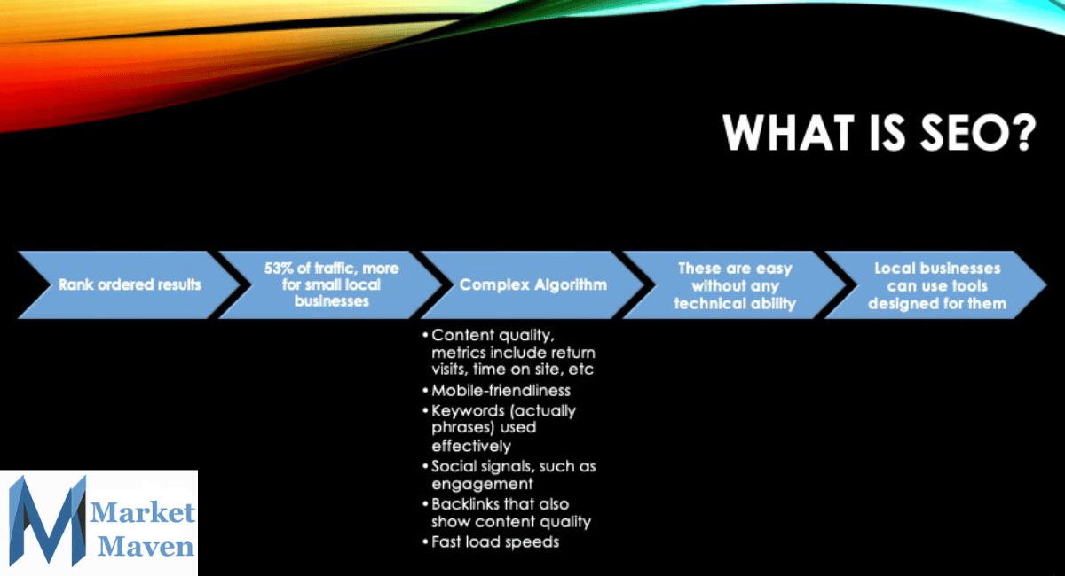
Without an effective SEO strategy, you won’t be able to attract organic traffic (which is more than half of all traffic visiting your site), achieve sustainable growth, and miss out on several opportunities from your marketing campaign.
Why mobile optimization matters for SEO
In 2015, Google introduced the “Mobilegeddon” update, which emphasized the importance of mobile-friendly websites. By 2019, Google had fully implemented mobile-first indexing, meaning that it now primarily considers the mobile version of your site when ranking and indexing. Consequently, optimizing for mobile is now crucial.
Mobile optimization is not just a necessity; it’s a game changer for your website’s success. By ensuring that your site is fully functional, visually appealing, and easy to navigate on mobile devices, you unlock the potential to reach a wider audience. Search engines like Google prioritize mobile-friendly websites (along with other key criteria), carefully evaluating key factors such as responsiveness, loading speed, and user engagement to determine rankings. With ongoing updates to Google’s algorithm underscoring the importance of mobile optimization, now is the time to invest in a seamless mobile experience. Don’t get left behind—make your website mobile-ready and stand out in the competitive online landscape!
Neglecting mobile optimization can result in lower SEO rankings, diminished organic traffic, and elevated bounce rates, all of which hinder your ability to attract and keep customers. On the other hand, a mobile-optimized website generally achieves higher positions in search results, enhancing brand visibility and boosting customer engagement.
Key elements of mobile optimization
Responsive web design
A responsive web design ensures that your website adapts seamlessly to different screen sizes and devices, which allows visitors to navigate content easily without excessive zooming or scrolling. Google recommends responsive web design because it uses a single URL for each page rather than creating a mobile and desktop version of each page, thus improving SEO rankings, reducing duplicate content issues, simplifying site management, and enhancing user experience by automatically adjusting the layout and design.
When creating your website, you’ll find most templates you might choose are responsive due to Google’s preference for this type of design. When customizing the template, keep responsive design principles in mind by using flexible grids, fluid image rendering, and CSS that support different screen sizes.
Page speed and load time
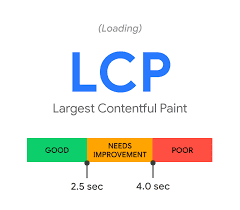
Page speed and load time are crucial for SEO and user satisfaction. Studies show that a significant percentage of mobile users abandon a page if it takes more than three seconds to load. Google’s Core Web Vitals (available through the Search Console) helps webmasters monitor the load speed of their sites and individual pages to improve their websites.
To improve page speed, you should compress and optimize images to reduce file sizes without sacrificing quality, minimize JavaScript and CSS files to enhance performance, use a Content Delivery Network (CDN) to speed up loading times, enable browser caching to store frequently accessed elements and reduce unnecessary redirects that slow down performance.
Mobile-friendly navigation
Navigation on a mobile device differs significantly from desktop usage. You expect intuitive, easy-to-use menus and a simple interface. Best practices for mobile-friendly navigation include implementing a logical menu that is easily accessible, using large, tappable buttons to avoid unintentional clicks, avoiding excessive pop-ups that disrupt the user experience, and ensuring the search function is prominently displayed and easy to use.
Readable and engaging content
Content is the core of SEO rankings. Text-heavy pages are overwhelming on any screen size but that’s especially true on a smaller screen, which leads to higher bounce rates. To optimize content regardless of platform, you should use short paragraphs to improve readability, ensure fonts are large enough for easy reading without zooming, prioritize scannable content with subheadings and bolded keywords, and implement structured data to enhance search engine visibility. Ensure images scale to fit the screen by using em (proportion of screen) rather than designating the size in pixels.
Mobile UX and touch-friendly design
As a mobile user, you interact with websites through touch rather than a mouse. A poorly designed site with tiny buttons or tightly packed elements can frustrate users and lead to high abandonment rates. To optimize mobile UX, you should increase button size to accommodate touch gestures, space out clickable elements to prevent accidental taps, and ensure forms are mobile-friendly with auto-fill functionality.
Avoiding intrusive interstitials
Google penalizes websites that use intrusive interstitials, such as pop-ups that block content. These are frustrating and interfere with users’ access of your content regardless of screen size. Instead, you should use small, dismissible banners rather than full-screen pop-ups, display necessary pop-ups only when they provide value (such as age verification or GDPR compliance), and time pop-ups to appear after users engaged with the content.
Optimizing for local SEO
Many mobile searches have local intent, meaning they’re looking for businesses near them. This makes local SEO essential for mobile optimization. To boost local SEO, you must ensure your Google Business Profile is complete and up to date, use location-specific keywords in content and meta descriptions, encourage customer reviews to enhance credibility and implement schema markup to provide search engines with detailed business information.
Your website needs to conform with user intent, as well. For instance, when searching on a mobile device, users often want information on the location (preferably linked to easily map the location on a mobile device), phone number, and hours of operation, so display this information prominently on the homepage.
Common mobile optimization mistakes to avoid
Despite the clear benefits, many businesses make mistakes that harm their mobile SEO rankings. Some of the most common pitfalls include blocking JavaScript, CSS, or images that prevent search engines from rendering your page correctly. Your website should allow full access to these files to ensure proper indexing. Using Flash or other unplayable content is another major issue, as Flash is outdated and unsupported on many devices. You should opt for HTML5 instead.
Poor redirects and broken links can significantly impact mobile usability. Ensuring mobile users are directed to the correct version of the page and regularly auditing links to fix broken ones is essential for a smooth user experience. Large media files can also slow down mobile pages, so you should always compress and optimize multimedia elements to ensure faster loading times.
The business benefits of mobile optimization
Optimizing for mobile not only improves your SEO rankings but also impacts your business performance. A mobile-friendly website enhances user experience, leading to higher engagement rates, longer session durations, increased conversions, and reduced cart abandonment. If your business has a strong mobile presence, you will also build greater trust and credibility among mobile users, making them more likely to convert.
As voice search and AI-driven search features continue to grow, mobile optimization will become even more critical. Ensuring your website is mobile-friendly today prepares you for future technological advancements, keeping you ahead of competitors.
Conclusion
Creating a seamless mobile experience is a fundamental aspect of SEO and online success. Google’s mobile-first indexing means you must prioritize mobile-friendly design, fast loading speeds, and seamless user experiences to maintain high search rankings.
By focusing on responsive design, improved navigation, optimized content, and enhanced performance, you can significantly improve your website’s SEO ranking, user satisfaction, and, ultimately, revenue. SEO growth strategies play an essential role in this process, helping you refine your optimization efforts, increase organic traffic, and stay ahead of algorithm updates. Aligning your mobile SEO strategy with these advanced techniques ensures long-term success in search rankings and digital marketing performance.
Need marketing help to support business growth?
We welcome the opportunity to show you how we can make your marketing SIZZLE with our data-driven, results-oriented marketing strategies. Sign up for our FREE newsletter, get our FREE guide to creating an awesome website, or contact us for more information on hiring us.
Hausman and Associates, the publisher of MKT Maven, is a full-service marketing agency operating at the intersection of marketing and digital media. Check out our full range of services.
Discover more from MKT Maven
Subscribe to get the latest posts sent to your email.


