 logo

Calls to action, or CTA, are among the most essential elements of any marketing strategy, particularly on the Internet. A call to action involves an invitation- mainly using words or graphics- informing a website’s visitors what action they should undertake next to progress toward the conclusion the brand desires. Examples of calls to action are asking visitors to sign up for a newsletter, download a resource, or make a purchase. Without a call to action, visitors may visit your site and learn about your products but aren’t clear about what the brand wants them to do. A poorly designed CTA is easily overlooked and/ or lacks the power to motivate the visitor to action. It’s like a salesperson visiting a prospective buyer and then leaving after discussing the products s/he offers.
 The above image shows an example of a CTA from my site. The CTA clearly motivates the visitor to take action and, when clicked, takes the visitor to my page, which offers various digital marketing services so they can learn more. Additional CTAs on those pages allow visitors to sign up for a consultation regarding the service that interests them.
Calls to action
For salespeople, we call this a close. In marketing, calls to action are among the most studied aspects as they greatly impact revenue. A compelling CTA has several characteristics, based on significant experimentation on which are most effective. Below are the results of these experiments.
Writing direct and unambiguous language
Clarity is one of the most crucial aspects of creating calls to action. In writing a call-to-action, use direct and succinct language as to what action you would want a visitor to perform and what they get for clicking. More precisely, action words such as “Sign Up Now,” “Download Your Free Guide,” or “Shop Today” leave little doubt about what a visitor can expect when clicking your CTA. Visitors should know exactly what they are supposed to get once they click your CTA. Don’t use jargon or wordings that can’t be easily understood by your target market. Also, keep it simple and direct. The simpler the CTA, the better the follow-through rate by visitors and the likelier the chance of conversion.
Below is a template for a good CTA, although ignore those aspects that are only related to email marketing.

Building scarcity
In his book on influence, Robert Cialdini discussed how to influence individuals to take action in various contexts. One of these, scarcity, works very effectively to overcome our natural tendency to procrastinate. In modern marketing, we call this the fear of missing out, or FOMO.
You could create a sense of urgency in your CTA to speed up the movement of visitors toward conversion. Using “Limited Time Offer,” “Join Now Before It’s Too Late,” or “Only a Few Spots Left” may urge the visitor to take action because they might not like the feeling of missing out on something. This technique works well because it’s based on the psychological principle that people are more likely to act when they come to believe an opportunity might be lost. However, it should be carried out honestly and with ethics in mind, where the scarcity behind the reason is valid. It will help gain trust between you and your audience, adding more reliability to your brand.
Using eye-catching design elements
Design also plays a vital role in calls to action. First of all, a striking CTA button will immediately catch the eye from among all the other elements on the page and literally invite clicks. Contrast can ensure that the background and your CTA can easily be distinguished from one another. You may want to consider the size and shape of the button (and buttons outperform text links in driving conversion).
The button should be large enough to click easily (especially on mobile), but it shouldn’t be so huge that it overshadows other content. Whitespaces around your CTA will also attract attention and help avoid accidental clicks, especially on mobile devices. Working with a web design agency can have a positive impact on that part of your marketing, ensuring that your calls to action are both aesthetically stimulating and in the right locations on the page.
Positioning CTAs effectively
The placing of your call to action will determine whether it is well seen and thus effective or not. It should be done in a place where visitors can easily see your website without intrusion. Familiar places where this tends to work very well are above the fold on your homepage, at the bottom of blog posts, and within sidebars. Also, consider adding more than one CTA on your website to handle a range of visitors who might be at different stages of their journey. A more robust example might go on a product page, while the blog post could use a softer, more informational CTA. Testing different placements will allow you to find out where CTAs work on your site.
A/B testing for continuous improvement
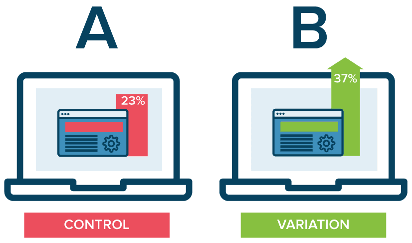
A/B testing is a helpful tool for improving your CTAs. You can have two versions of a CTA: wording, color, placement, or whatever you like. Compare the performances to understand which one is more effective with your audience. That data-driven approach lets you decide based on real on-site visitor behavior, which will increase conversion rates over time. Regular testing and optimization of your CTAs means that you’re not shooting at a target in the dark but adjusting according to concrete feedback from your visitors.
Incorporating social proof
Social proof is another one of those tools of influence from Cialdini that we mentioned earlier. Elements of social proof applied to your calls to action can facilitate trust and credibility for the latter. By adding testimonials, user reviews, or statistics, one can soothe the visitors that they indeed are making a good choice by taking that action recommended by you. A typical example would be something like, “Join today and become a part of more than 10,000 satisfied subscribers!” when trying to get them subscribed. In such cases, this can take out the cold feet from visitors and help them engage with your brand more often.
Tailoring CTAs to your audience
Tailoring CTAs to Your Audience Finally, knowing your target audience makes all the difference when writing calls to action. Different demographics may respond differently to various styles, tones, and messaging. You could study market research or use customer personas to show you how to position your CTAs to their interests and motivations. For instance, an older audience would probably be more fitting for a professional pitch rather than the need to use hip language and bright colors to capture their attention, and vice versa for a younger audience.
Conclusion
Applying insights about your audience can help personalize your CTAs for better results in engagement and conversion rates by including them. The art of crafting calls-to-action requires clarity, urgency, design, and audience insight to come together. By using direct language, eye-catching visuals, high-performing placement, and by continuing to optimize through A/B testing, you can have CTAs that really deliver a considerable boost to your conversion rates. By enlisting social proof, credibility is gained and ensures that the visitors will more willingly take the action desired from them. This way, you can rest assured that your CTAs will drive attention right down to desired and meaningful action and, hence, contribute to the success of your website.
Need marketing help to support business growth?
We welcome the opportunity to show you how we can make your marketing SIZZLE with our data-driven, results-oriented marketing strategies. Sign up for our FREE newsletter, get our FREE guide to creating an awesome website, or contact us for more information on hiring us.
Hausman and Associates, the publisher of MKT Maven, is a full-service marketing agency operating at the intersection of marketing and digital media. Check out our full range of services.
Discover more from MKT Maven
Subscribe to get the latest posts sent to your email.


